Foot Locker Checkout Redesign
Problem
Foot Locker’s checkout abandonment rate was 15% higher than industry average. 34% of users bounced prior to completing shipping information and 24% of users bounced after entering their address but before entering payment information.
Objective
Optimize UX to meet market parity, reduce friction and decrease time to checkout so users can more easily complete the checkout process.
Outcome
+ 8.3% Checkout to Order CVR
-00:36 in time spent checking out
+10% OSAT
Understanding User Needs
Preliminary benchmark UX Research told us that checkout should be an effortless, clear and compelling experience.
Effortless As a user, I should be able to quickly fill out the necessary information and purchase an item with ease.
Clear As a user, I expect the checkout experience to clearly communicate product, delivery and pricing information so I can be confident in my purchase.
Compelling As a user, I should be excited by the checkout purchase process through modernized visuals and engaging interactions that reflect the brand.
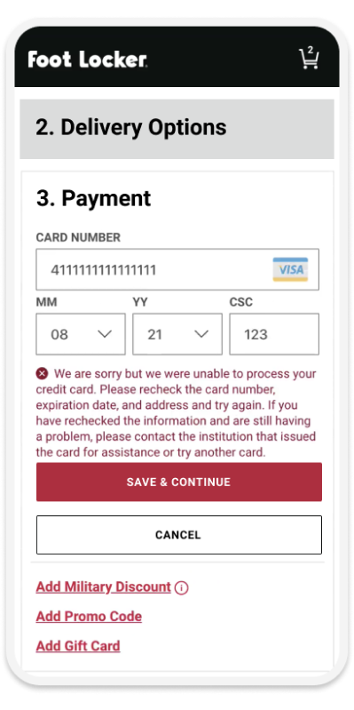
Original Checkout Experience
Design Iterations: UXR Snapshot
During the design iteration process, we created various prototypes to validate with users, ultimately guiding us toward our MVP.
Through compromise and collaboration while up against code freeze deadlines and in an effort to accelerate, here’s where our MVP landed…
Contact Information
Before
After
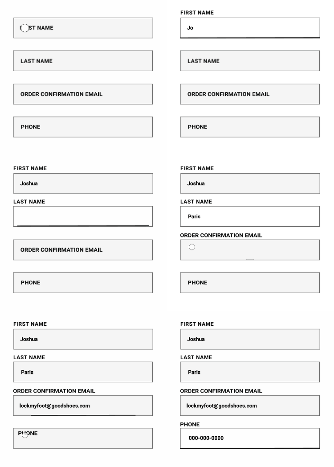
New Form Animation


